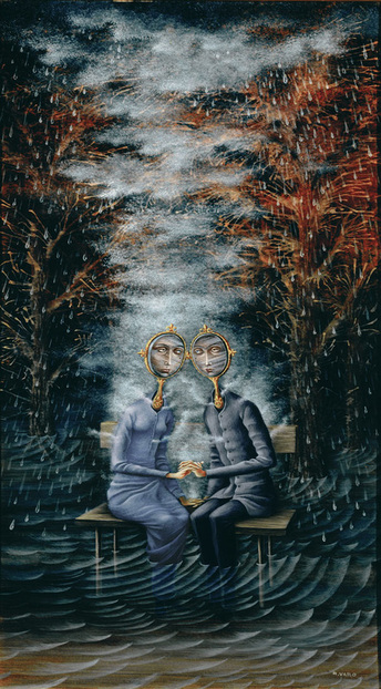
 Remedios Varo Uranga, uno de los mundo surrealista para los pintores del siglo XX, nació en 1908 en la pequeña ciudad de ángulos en la provincia de Girona en España. Su arte única fue el resultado de su crianza y socialización en un mundo de arte y filosofía, las luchas de su vida así como su asombrosa imaginación. Estos movimientos exponen Remedios a diversas culturas y ampliaron su visión del mundo y esto fue más tarde reflejar en su arte. En 1923, cuando ella era un estudiante en la escuela de Artes de Madrid, Remedios hizo su primera obra de arte. Ella pintó su retrato, así como la de su familia. En 1924, se incorporó a la mejor escuela de Artes de Madrid, San Fernando Academia de Bellas Artes, donde se graduó con un diploma de profesor de dibujo en 1930. Fue en esta Academia que ella conoció el surrealismo, un movimiento cultural y la filosofía que animó a la captura de la funcionalidad real del pensamiento humano, sin controles como razón y moralidad. El arte surrealista se utiliza para expresar el movimiento filosófico. La pintura se llaman los amantes. El género de esta pintura es surrealista. Sé esto porque muchos de los Remedios, las pinturas son de este estilo y la forma de los objetos en este cuadro son, llevar a elementos comunes del arte surrealista. La pintura de los amantes tiene muchos detalles imaginativos. En el fondo, es lo que parece lluvia y una noche de tormenta. Esto puede determinarse por el agua oscura y colores oscuros siendo utilizados. en el frente hay lo que parece un hombre y una mujer sin embargo sus cabezas de espejo parecen idénticos como si están viendo uno al otro y si esto es hacer que el sentimiento de hombres y mujeres, siendo la misma. en el centro hay colores más oscuros aún, pero con más de un efecto de sombreado. los lados izquierdo y derecho tienen casi lo mismo con un moribundo árbol lluvia y el agua oscura. En la parte inferior las patas de los pueblos son conseguir ahogadas por el agua oscura que se traslapa alrededor de ellos. la mujer lleva un vestido azul de manga larga mientras que el hombre lleva un suéter gris con negro pantalones vaqueros. Me gusta esta pintura porque su creativo y puede tener muchos significados dependiendo de cómo usted piensa de él.
0 Comments
Pierre Bonnard’s oil paintings Dining Room Overlooking the Garden (The Breakfast Room) (1930-31, The Museum of Modern Art), Dining Room on the Garden (1934-35, Solomon R. Guggenheim Museum), and Table in Front of the Window (1934-35, private collection) display several visual qualities that define a recognizable style. These similarities can be seen in the works’ subject matter, composition, texture, color, and stylization.
All three works show the same subject matter. Dining Room Overlooking the Garden depicts a tabletop covered with various objects, including a book, tableware, and fruit, in front of a large window that frames a garden landscape. To the left of the window is a woman, cut in half by the edge of the picture. Outside is a balustrade and, beyond it, a path surrounded by dense vegetation. Dining Room on the Garden also shows a tabletop in front of a wall with a window. This tabletop contains two bowls of fruit, a vase with flowers, a pitcher, a mug, and two books, among other objects. Behind the table are two chairs. To the right of the window is a standing woman. Through the window, a strip of water is visible between the sky and a garden path that is flanked by trees on either side. Like the other two paintings, Table in Front of the Window also depicts a tabletop in the foreground and a wall containing a large window behind it. The window frames a landscape composed of an area with vegetation sandwiched between a path and the sky. The tabletop contains a bowl of fruit, a book, and other tableware. The top of a wooden chair is visible directly behind the table. The arm and head of a human figure emerge from the right border of the painting. The arrangement of the subject matter in the composition is also very similar. Each one depicts an interior space with a human figure and a table in front of a window that frames a landscape. In the foreground, a combination of books, fruit, and tableware is dispersed around the tabletop, which fills the lower portion of the work. The viewer of the picture looks down on the table. Behind the tabletop, a large window occupies most of the remaining space. The window is divided into one or two sections by its frame, and it is shown between curtains or the walls of the room. The figure at the side of the window is only partly visible, cut by the edge of the picture, cast in shadow, or blended into the wall. In the background, a landscape with trees and a path can be seen through the window. There is a strong emphasis on the vertical in each of the compositions. In Dining Room Overlooking the Garden, the tabletop is patterned with blue and white vertical stripes. Two vertical strips, which divide the window, are parallel to the woman. The balustrade in the garden has repeated upright columns. Behind the fence, a winding path leads upwards toward the horizon. In Dining Room on the Garden, the woman stands parallel to a vertically oriented window frame. The chairs behind the table contain vertical elements as well. There is a darkened, vertical stripe on the left side of the wall. Almost all of the objects on the table, especially the pitcher, mug, vase with flowers, and bowls of fruit, open upwards. In Table in Front of the Window, the tabletop is patterned with white and red vertical stripes. The book and bowl of fruit on the table, as well as the three supports of the chair behind the table, guide the viewer’s eye upward along the vertical window frame. A seemingly chaotic use of texture and color typify the paintings. The brushstrokes are clearly visible and appear to come from many different directions. The paint is applied quite heavily so that globs project from the canvas. This creates the impression of a rough and splotchy surface. Furthermore, the colors are never completely mixed. For example, in Table in Front of the Window, the bowl of fruit appears to be white from afar. When examined up close, however, it turns out to have various streaks of differing hues, including red, purple and black. Therefore, the colors look saturated and vibrant when viewed from a distance, but appear muted in close proximity. This creates the illusion that the work is pulsating. The highly stylized forms in Bonnard’s paintings are characterized by warped shapes and indistinct attributes. The shape of each element in the paintings is slightly askew from what it might look like in real life. For example, the bowls and plates are not perfectly rounded. Instead, the edges constantly waver. Similarly, the window frame, which one would assume is completely erect, curves slightly. These warped forms are further distorted by the blurring of their features. This can be seen most obviously in the garden landscapes. The vegetation is composed of masses of variously colored blobs, which are only recognizable as branches or bushes by their context within the work. Bonnard uses obstructed forms to play with the viewer’s sense of space. In each work, the lower border of the picture cuts off the tabletop, and the upper border cuts off the window. Only a small sliver of the wall can be seen on either side of the window. This makes it impossible for the viewer to know the exact size of the table and window, or of the room that contains them. Only a portion of the garden landscape is visible through the window. The vertical framing in the windows further disrupts this view. The human figure in each of the works is also obstructed. In Dining Room Overlooking the Garden, the left border cuts off half of the woman’s body. The woman in Dining Room on the Garden is hidden behind the tabletop and a vase with flowers. In Table in Front of the Window, only a portion of the figure’s head and arm is visible. These obstructed forms give an air of mystery to Bonnard’s paintings and leave the viewer wanting more. 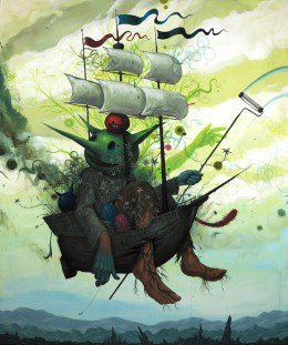 Soto's "The Last Voyage" is a painting on wood panel, 72X60 inches, it is done in acrylic, and was part of a body of work Soto exhibited in his "Life Cylces" exhibition held at the Johnathan Levine gallery.
The subject matter, like much of Soto's work, is a monster that has human-like characteristics, inhabiting a desolate land that resembles our earth. It could be a futuristic earth or a made up world, but the connection to humanity and our environment is undeniable. The figure in the foreground is crammed in a ship that seems to over between a desolate landscape and a polluted, yet bright sky. The landscape below is a gray and blue expanse of barren mountains that jut out towards the creature in the ship and the blue sky. The sky turns from blue to green, as Soto uses his trademark swirls and graffiti inspired circles and spirals, making it look like pollution, here. There is also a stream of exhaust coming from the back of the ship, making it appear to hover, as if it cannot completely leave the empty land it comes from, yet cannot continue skyward, to someplace new and of promise. The sky, despite its green, polluted atmosphere is bright and there are white clouds that linger about the ship, hopeful in the contrast to the greens and blues. Behind the figure that sits in the ship, there is another, more vibrant green in the shape of tree branches that come out like a shadow. Also included is an arm that echoes the figures own arm and points skywards toward the distance. The sails and flags of the ship fly above the figure and the shadows behind him. The flags seem to have a lot of motion in them, as if they are joyously waving in the wind, waiting for the ships arrival; whereas the sails, though full, seem smaller than the rest of the figures in the composition. In comparison to the large body stuffed into the ship, they seem minuscule, as if they are not large enough to support the ship and its voyagers. Below the sails, sits the actual figure of the composition, and perched on his head is a round, red ball-like creature, that has jagged teeth, beady black eyes and a sinister smile. He simply sits on the head of the creature below, whose green face looks less monstrous than that of the thing above him. The main figure has pointy ears and oval, blue eyes. His teeth are also jagged, but less so, and his smile is more benevolent. In contrast to his green face, the figures feet and wrists are flesh colored, while his hands are blue and look as though they have been dipped in paint or turned that color due to frostbite or some infliction. His left hand holds a paint roller on a long pole, it extends to the far right hand of the composition and we can see a light blue trail that it makes across the green and white sky. In his right hand he holds an anchor that dangles behind him, towards the mountains below. The anchor is tiny and is attached to a small piece of string. The figures large body is covered in a garment that resembles a burlap sack, although it is furry and grey. The fur resembles that of a fluffy and cuddly animal, yet it is clearly not growing out of the figure, because the garment is torn off at the wrists and the ankles. The figures feet busts through the hull of the ship and dangle in the air below. They look relaxed, as if it is no big deal that this creature cannot fit into his vessel. Vines cover the feet and wrap around the ankles, coming from inside of the ship. There are also tiny flowers and vines covering the figures form, as well as growing out of the back of the ship and the sides. The flowers are stylized so that they resemble decorations from wallpapers and look less than natural. They are gray and pink and cover nearly everything in the ship. Next to the figures legs and lower body are two fluffy conical forms that are blue and pink. The way he has them snuggled to his body they could be children or stuffed animals or something that allow him comfort, since they are the only thing that seems friendly, other than the flowers in the composition. To the main figures right, perched on the side of the ship is another creature. This one has his back to the viewer, facing the main figure, with his black tail hanging off the side of the ship. His body, like the other small creatures, is round and his ears are long and pointed. He is colored black. On the other side of the main figure, there is another fuzzy tail-like object that hangs over the ship. This one dangles down, then curves upward, like the tail of a cat or another animal that has control over its tail. This shape and angle of the fluffy tail would make the viewer assume that it is attached to something that has control over it and is able to raise it into the air, instead of allowing it to dangle over the edge. Lastly, the ship itself, as I have said earlier, looks as though it is suspended in the air, above the desolation and below the clouds and sunlight that come from far into the distance, penetrating the green smog and pollution that hovers above the barren mountain range. The ship itself is nothing fancy. It is a grayish brown color and looks like a typical pirate ship. It is not ornate or extravagant; it is simply a wooden ship that is too small for its voyagers. The ship is in fair condition, except for the feet that have been shoved through the hull, breaking the planks that it is made from. The black exhaust that comes from the back of the ship also represents the struggle it seems to be having. As though it cannot leave where it came from, it does not have the strength, yet it cannot return, for there is nothing to return to. The captain of this ship is hopeful, as he paints his future in the sky above and beyond the land he leaves behind, yet he is also tied to his native land, by the anchor he holds in his hand, although it is tiny it is just heavy enough to keep the ship in a state of flux, unable to descend and too heavy to continue on its journey. Is this a visual metaphor for humanity and our complex relationship with our own environment? Soto’s work as a whole seems to be a critique on our humanity, as well as a celebration of it. Despite his usual dark, graffiti influenced style; there are always aspects of bright colors, and vibrant juxtapositions within the darkness. Does this represent our current state as human beings surrounded by a built environment and a culture that has separated itself from nature so much that we are unable to return to it, even if we wanted to? Yet what about the bright colors, what do they represent? A new hope for humanity or could they symbolize the cycle of life and that with death and destruction there is a new beginning, a new start? The title “The Last Voyage” helps explain this a little bit. I feel that this particular piece by Soto is about this complex relationship we have with our environment. Through depicting a made up creature in a made up world, Soto makes a metaphor for our humanity. We are no longer human beings from nature and earth, we are our own product of a culture that has done nothing but harm our environment, we our people who have destroyed our natural surroundings in favor of a built environment. What Soto captures in this creature is our own humanity. Our innocence and our hope, this is what is bright and vibrant in his work. Despite all our flaws, humans have the ability to love, to care, and to nurture. For example, in this piece the characters smile is much more benevolent than the red creatures, his eyes are gentler and he is surrounded by flowers, despite the fact that one can deduce that his kind could be the reason why the mountains are barren. Something in Soto’s work is hopeful. This is the hope that there is hope. This hope stems from rebirth, the cycle of life, the belief that even if human beings were wiped off this planet that something might continue to live, to grow, to prosper. It is a belief that life will preserver no matter what because that is the natural order of things, even if this life is not human being, it is still life and it still exists and that will never cease. Even Soto’s materials can be a representative of this ideal that his work is about the relationship we have with our environment. Through a juxtaposition of dark, graffiti inspired imagery, and bright cartoon aspects he conveys a metaphor for the destruction, yet necessity and reverence of our environment and our natural world. By illustrating his cultural influences of cartooning, graffiti, and pop surrealism, and realistic imagery the viewer is able to understand a dynamic relationship that exists within our material and visual culture and our connection to the earth in which we came from and grew out of. 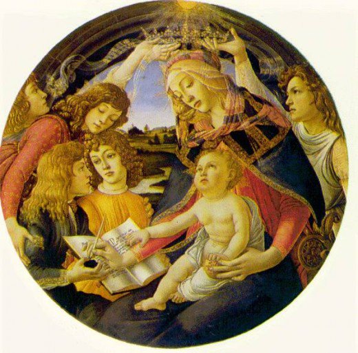 “Madonna of the Magnficat” was created by Alessandro Botticelli in 1480-1481. The painting depicts the Holy Mother, Mary, holding Jesus as a baby while writing in a book, as two men, possibly angelic figures, hold a crown above her head. Mary looks upon Jesus, and the world, somberly, knowing his destiny to come. The tone of this piece of religious artwork, I think, is attributable to the period of time and location in which it was created. Sandro Botticelli was a renowned artist during the early Renaissance period in Florence, Italy. Avid Catholicism was largely emphasized during the time of the Renaissance, especially the earlier period; it is also factual that a large majority of Italians practice Catholicism. The amount of religious provocation, and the type of ambience portrayed by the Church, in Botticelli’s time helps provide understanding to the true symbolism of the painting. Around the same time of the creation of the “Madonna of the Magnificat”, Sandro was summoned by Pope Sixtus IV to assist in the creation of artwork used to decorate the Sistine Chapel. This fact also helps to provide clues as to the true meaning of the painting in that, at that certain time, he was influenced by the Pope, who may have pushed his own ideas onto Sandro, to create a certain type of religious art.“Madonna of the Magnficat” was created by Alessandro Botticelli in 1480-1481. The painting depicts the Holy Mother, Mary, holding Jesus as a baby while writing in a book, as two men, possibly angelic figures, hold a crown above her head. Mary looks upon Jesus, and the world, somberly, knowing his destiny to come. The tone of this piece of religious artwork, I think, is attributable to the period of time and location in which it was created. Sandro Botticelli was a renowned artist during the early Renaissance period in Florence, Italy. Avid Catholicism was largely emphasized during the time of the Renaissance, especially the earlier period; it is also factual that a large majority of Italians practice Catholicism. The amount of religious provocation, and the type of ambience portrayed by the Church, in Botticelli’s time helps provide understanding to the true symbolism of the painting. Around the same time of the creation of the “Madonna of the Magnificat”, Sandro was summoned by Pope Sixtus IV to assist in the creation of artwork used to decorate the Sistine Chapel. This fact also helps to provide clues as to the true meaning of the painting in that, at that certain time, he was influenced by the Pope, who may have pushed his own ideas onto Sandro, to create a certain type of religious art.
 For my visual description, I chose to write about an oil painting on wood by Emil Nolde, Large Sunflowers I. The work, which is about two and a half feet high and three feet wide, shows eight sunflowers with their leaves, seen from close up. Some of them are cropped by the edges of the canvas, so we have only a partial view of their blooms. They vary from about the size of a cantaloupe melon to about the size of an orange, which might be the actual dimensions of these flowers. The colors range from yellow, yellow-orange, and light red, to dark red. All but one of the yellow-toned flowers have deep brown centers, while the red ones have deep reds and browns at their centers. The sunflowers are surrounded by large green leaves and stalks. The brilliantly colored paint is thick, and has been applied in big, visible brush strokes.
The sunflowers and leaves take up most of the composition, but there are indications of an outdoor space around them. A strip a few inches high at the top of the painting forms a horizon line, filled with an awesome sunset of reds, oranges, yellows, and browns. An orb of the deepest red and orange toward the center depicts the sun itself. Between the leaves, hints of dark blues and greens suggest shadow and depth, possibly in a large garden or field. Towards the bottom of the painting, dashes of red suggest more sunflowers behind the ones we see. The focal points of this composition are the biggest sunflower, to the left of center, and a pocket of leaves in the center itself. The flower is deep yellow with a muddy, yellow-brown center. Some of its petals are bending, possibly wilting or swaying in a wind. It has a bright green stalk, with a streak of yellow paint through it. The leaves in the center are a bright green with hints of blue, whereas the other leaves in the painting are a deeper green, more like the color of an actual sunflower leaf. They also are distinguished by the wavy brush stroke that appears here, which is different from the shorter, straighter stroke used for the other leaves in the painting. The artist seems to have used the same large brush throughout the picture, although the paint was applied in different ways. Long, continuous strokes appear in some of the stalks, for example, while the flowers have been made with short strokes, cross weaves, and waves. In many places, the paint was applied thickly and wet on wet, color on top of color before any of it had dried. The result is that the edges of the strokes bleed into each other. In some areas, new colors were made by blending colors directly on the canvas. These techniques combine to make this painting a vivid image of nature. 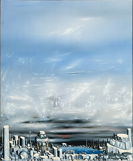 This paper will be a visual description of From Green to White, an oil painting made by the Surrealist artist Yves Tanguy in 1954. A vertical composition of about 39 x 32 inches, the picture describes an imaginary place using tiny, barely visible brushstrokes, so that the surface of the painting is almost perfectly smooth. What appears to be a strange city, naturalistically shaded to suggest space, fills the bottom fifth of the composition. The rest of From Green to White looks like sky. The lower part of this section contains dark, wavy, horizontal bands, interspersed with streaks of red, pink, green, and blue. Above that is an area of white, tinged slightly blue. Streaks of bright white within it give the impression of being shimmers of light, or reflections from a block of partly melted ice. These streaks fade out about halfway up the picture, leaving what appears to be a blue sky with a few wispy white clouds in it.
The strange city at the bottom of the composition consists of many rounded shapes that suggest oddly proportioned structures made out of grey rock. The simplest are cut-off cylinders. One at the left edge of the picture is the tallest element. A flat low form in the middle, which extends across nearly a third of the width of the picture, has a blue roof with what look like strange waves and a single orange oval on it. These are the only things that are not some kind of grey color. To the left of this structure is a tower with grey-green vertical tubes along its sides. Window-like openings go around it. To the right is the largest structure of them all, like a ziggurat made of three circular flat-topped tiers. Between it and the blue roofed form are 8-10 tall, dark, flat spires. A thin grey cylinder rises along the right edge of the composition. The title, From Green to White, gives no hint of what Tanguy meant to represent in this painting. The picture itself also provides no clues. The shapes and forms that are so carefully described do not suggest an interpretation that makes sense of what we see. Therefore, the work remains a mystery, a precisely detailed view of an imaginary world we can never know. Rococo was a style of art that followed on from the Baroque period in the early 18th century. The artists of this style typically depicted themes of "love, artfully and archly pursued through erotic frivolity and playful intrigue". 1 Both the art and interior design of the time displayed a sense of rhythm in which "[e]everything seemed organic, growing, and in motion, an ultimate refinement of illusion". 2 The artists of this period were also starting to express themselves and their feelings about their themes in their work. Some of the works seem to be edging toward the ideals of the Romanticism period, even though they were at opposite ends of the 18th century.
Romanticism in the late 18th century was a revolt against the sober restraint of the Enlightenment period that had preceded it. 3 This was a period encompassing the "desire for freedom - not only political freedom but also freedom of thought, of feeling, of action, of worship, of speech and of taste". 4 Artists wanted only to produce pure, truthful art that was "based on the predominance of feeling and imagination." 5 Works in the Romantic period depict not only the Romantic ideal of love but also 'Gothic' horror, as this too could be explored to discover the 'sublime'. The works discussed in this essay share obvious similarities. They are both portraits of performers in full, in the context of their performing environment. In Watteau's L'Indifferent, there is a sense of the subject posing for the portrait in a very festive manner which is characteristic of the Rococo period. By contrast, in Delacroix's Paganini the performer seems to carry himself with a much more intrinsic purpose, perhaps enacting a more truthful value that is typical of the Romantic ideal. There is, nevertheless, a similarity in the two poses that suggests motion, as both performers seem to be caught in mid movement. This dynamic quality was not typical of the other art movements prior to or during the 18th century, where portraits tended to depict people in staid, Watteau's painting of the dancer seems soft and flouncy, yet it is obvious that it is a well thought out work. The writer's choice of language has indicated the conditional nature of the observations. The colours are used to compliment and support the painting's composition, with the hue of the foliage seemingly reflected in the velvet of the dancer's clothes. The colour used in the cape has also been added to the accessories on the shoe and hat. Both of these examples of the use of colour show how the clever composition of the painting successfully draws the viewer's eye around it. When expressing the difference between the Baroque and Rococo periods, one art critic noted that "[Rococo] aimed no longer at astounding the spectator with the marvelous, but rather at amusing him with the ingenious." 6 This statement demonstrates that the attention to compositional detail is both a necessary element of the Rococo period and also of this work by Watteau. Delacroix's painting Paganini also displays a strong attention to colour. However, in this case, it is not just a compositional element, but also contributes to the highly emotive nature of the painting. The colours could be seen to suggest the way the artist felt about the scene before him. This portrayal of the dancer's performance, using the poignant yet subtle blends of dark earthy background colours which contrast with the smooth deep black tones in the figure, enhances the feeling of balance and melody. This combination of art, music, theatre and dance was of high interest to the Romantic artists as it was a great source of the 'true' or 'pure' emotion which they sought to represent. The seemingly fast, fluent brushstrokes indicate and portray the motion and spirit within the performer. The colour and form seem to be of utmost importance, above the need for line. Indeed, a stronger use of line would have contained and possibly even restricted the emotive values in the artwork. This style did not go unnoticed by critics. Both Delacroix and Jean-Auguste-Dominique Ingres were referred to as Urbanists and Pessimists respectively, due to their use of the 'academic' style of line or the 'romantic' truth of colour as the main element in their works, although both are now recognized as Romantic artists. 7 The composition in Paganini is flowing and melodious and is greatly enhanced by the aforementioned use of colour and the form of the performer. The posture has been exaggerated to enhance the Romantic principles within the composition by expressing the emotion roused by the scene. Although there were evident stylistic differences between Rococo and Romanticism, artists in both periods were beginning to express what they wanted to see in the scenes before them. Where Rococo was a time of idealizing the frivolity of the upper classes, Romanticism idealized the world around the upper classes, depicting the good, the bad, and the ugly equally by looking for the sublime in everything. Both paintings discussed in this essay provide great insight into their own periods but also into the foundation of the Expressionist movement Fernandos Llork’s art pieces have always had a sentimental attachment that trace back to my roots. Being born and raised in El Salvador, I know the impact of the landscapes he portrays in his paintings. The rivers, the mountain, the plants and trees create a strong connection between nature and the people, a connection that is rarely found today in modern civilizations. It is as if his paintings could describe exactly what El Salvador is. But not only describe the actual locations, like the small town brick houses. Not only the physical resemblance of the people’s features: their skin color, the thick black hair, and their intense eyes. Not even the strong spiritual influence on daily life, which comes from the mixture of Indian and Catholic traditions. It is more than that, he is able to describe the true spirit of El Salvador: that playful, hardworking, inviting, hospitable, colorful nature of everything you see and everyone you meet if you where to go to this country. Craft, ceramics, sculpture, and wooden works are all traditions that have been a part of our heritage, beginning with our native Pipil and Mayan descent and continuing as part of our culture to this day. Fernado Llort is able to use each of these and portray our traditions in a nonlinear fashion. I think every Salvadorian feels the same way about his art work and that is why he’s work has become a symbol of our culture. The historical and cultural contexts play a very important role in all his pieces, but at the same time, he is able to make them transcend so that they can be appreciated by someone who is not familiar with this context. His work can be found in places like the White House, art galleries in France, and the Vatican Museum (Tribute to Fernando Llort website) Llort is able to connect so deeply to the culture though the use of unique techniques and elements including color patterns, shape and form.
There are certain fundamental components that you will find in all his art work, no matter if it wood, ceramic, paintings, murals, etc. The first component is how he uses color. His paintings are saturated with bright blues, yellows, and greens. The contrast it creates is overwhelming to the eye. Your eye cannot settle in one place because the colors take you around the paintings through every detail, which at the same time intensifies and unites the whole work itself. There is a need to look for the detail, as much as a need to step back and look at the whole picture. The second component is the use of familiar figures such as bird, women, houses, and trees. The sun is a figure that constantly appears in his paintings. Not only does it create a focal point to the overall form of the paintings, but it is symbolic as well. El Salvador is a country with no winter. The sun is life; with out it the greens of the plants, the tan of people’s skins, nature itself would not be possible. Like the sun, the images of women also reemphasize this denotation of life. Women are the bearers of life, the bearers of color. The women in his paintings are iconic symbols of the local rural women, who posses an exotic beauty depicted in his paintings. These women carry the traditional responsibility of motherhood (6 to 8 children per family) as well as other hard jobs in the fields and in the household. The strength of the Salvadorian women is almost as incredible as their beauty. The repeating figures of the natural world help reemphasize the main theme of his painting: nature as an integral part of daily life. Just like his paintings are filled with nature, so is the country. The trees, mountains and the plants tie back to nature and its overwhelming impact on the life of rural families, most of which depend on coffee, sugar and other crops as mean of living. The brick houses portrayed in the paintings refer to the small town life. Even the two largest cities, except for the capital, give the impression of being towns; their building antique and the houses with old brick roofs; all with an affinity to the past. Finally his obsession with birds, I believe, has some religious denotations. Every cathedrals and every park adjacent to them are packed with birds. Each sunset that accompanies the 6 o’clock Sunday mass, is not complete without flocks of birds that glide through the orange sun as it settles in the horizon. The third element that is repeated through his paintings is his consistent themes, which are described though the names of his paintings. These names combine perfectly with his unusual technique, referred to by some people, as the naïve technique. “Llort has created a unique design style reminiscent of abstract sketches by Picasso, vibrant in color, beautifully arranged and almost childlike in their joyful versatility.” (Tribute to Fernando Llort website) Song of Life, Symphony of Happiness and Unity, Force of Life, Hope, From the Sky to the Earth, and Gift of the Morning are some of his most famous tittles. All of his title have an optimistic and happy connotation, maybe a little bit more upbeat than the reality of things. His technique, naïve, almost describes what his paintings do. They show how a child, a naïve child, would view the scenery around him. His childlike figures accompanied with the bright colors depict a positive outlook, almost too positive. It shows a fantasy of reality, a hope of what could be. Although the country is rich in culture and nature, the pressing problems of society, like war and poverty, almost make us forget what could be there, or better said, what has been there all along. Through his painting he tries to bring back that forgotten connection to the spiritual, natural and cultural world that hides beneath dirt. A child would see these things because he is hopeful, untouched by human evils. Llort acts as like that child that brings adults back into the realm of reality, a reality that to many adults feels more like fantasy. Use of geometric patterns is also very important to complete his work. Strips and lines of color are characteristic patterns of the typical Salvadorian clothing, hammocks, hair adornments, mantles, etc. In his paintings, the use of these “puzzle like” geometric pieces ties one element to the next bringing them together as a unit to tell a specific story. Through the use of these geometric lines and figures he also mimics the patters of nature. Each piece is put together to imitate the different hues and patterns of the coffee harvest hills, the lines that divide up the different greens of leaves, and the mixtures of colors in birds feathers, for example. My favorite piece is Al Beso del Sol, which because of a lack of a better translation is know as “Beneath the Sun’s Kiss”. The piece includes all of the traditional elements of Llort’s work, and it also tells an interesting story about history and religious believes. The best way for me to begin an interpretation of this piece is to start by looking of the order of things. The sun, for example, is placed at the very top of the painting, shining its orange hues down on everything else. Next we have a woman, who is so close to the sun to the point that it is kissing her. The mantle over her head seems to spreads out, almost melting into what appears to be a town. You can make out houses, the mountains, a water body and even a hammock that sits near the bottom right corner. There is also a bird with colorful feathers that wants to fly toward the sun. The religious symbolism reveals itself when this story is created. She is more than woman, she is Virgin Mary. Her closeness to the heaven is depicted by her proximity to the sun. But even though she is high above in the sky, she still touches down to connect to earth; her mantle protecting and bringing life to the people below. She becomes the connection between heaven and earth. The bird, as in many other of his pieces, symbolizes rural life and the Catholic influence on its people. The woman could also represent an Indian goddess. Her black silky hair, her big intense black eyes, and her clothing all resemble those of a native woman. Her presence in the town brings a spiritual bond to the natural world. She stands for the traditions that believe crops and harvests are completely dependant on natural events, which in turn are controlled by a higher power. The harmony of life depends on keeping a good relationship with the higher power. “Al beso del sol” means everything revolves around sun, because its presence is essential to watch and keeps everything in order. The kiss is a sign of approval for things to continue on. One of the interesting things that caught my attention was the fact that the size of the sun does not match the importance given to it. But I think this creates a sense that although he is the creator, he simply stands back and watches as his creation develops into a dance of colorful scenery.
These three works of art, distinctly different from each other upon first glance, share many stylistic features that distinguish them as landscape paintings by a single artist – Wang Hui. Reading Next to the Window in the Mountains depicts a grand mountain range, painted on a one foot by five foot, vertically-oriented hanging scroll. What caught my attention was the spatial composition, the way in which a long sequence of mountains fits on such a narrow picture. They run the entire length of the paper, weaving left to right as they work their way upwards to the highest peak. Not only is there an illusion of recession in space, but an illusion of rising in space is worked in as well. You can see that the peaks higher up on the composition are farther away, as well as physically taller. This spatial organization is repeated in both Autumn Forests, which has a very similar set of mountains, and Water Village, with its gently rolling hills winding up to a modest peak. This double-effect of space is made possible by a visual backbone found in all three works. Wang Hui creates a pattern of repetition with mountains and hills that looks like the backbone of an animal. Especially in Reading and Autumn Forests, rocks and peaks overlap each other, with each one slightly higher than the last, acting as vertebrae in the mountain chain. To distinguish the individual geological forms from one another, the painter uses gradients of grays and colors to highlight the edges. The result is a light and dark banded pattern which gives the forms dimension, and directs your eye along the backbone, and up the painting.
The scale of these mountains is also a stylistic signature of Wang Hui. Civilization is evident in all three works, but it is represented as insignificant, almost an afterthought. The rooftops, boats, and people which appear in the pictures are miniscule – each subject taking up no more than one square inch, and completely swallowed by the surrounding landscape. The sweeping shapes of nature are the focus of the compositions. Wang Hui depicts these scenes using ink in a consistent manner. Although the materials are different, with only black ink in Reading and a very limited color palette – mostly light green, light orange, and gray – in Water Village and Autumn Forest, the technique is the same. He uses very light washes to fill in the rocks and formations after he has established their edges with slightly darker lines. The washes of green and orange often fade into each other, and his gray washes are gradiated with white. On top of these washes are complex and meticulously rendered details painted with dark ink and a very fine brush. For example, it seems as if every leaf and ripple of bark is shown on the trees. Autumn Forest features about a dozen trees in the foreground, with each individual branch and leaf drawn and overlapping, creating a dense mesh of lines. Reading features three large trees which take up the bottom quarter of the composition. Again, the branches are so finely detailed that, seen from afar, the trees become a dark sprawling mass. The trees in Water Village are on a much smaller scale, but fine details can be seen on them as well. The impressive trees are not the only showcases of fine details. Countless tiny dabs of paint, no more than one-quarter inch long, create varying textures. Reading is a study in density, with seemingly millions of tiny touches of paint forming shrubbery, depicting tiny trees in the distance, and providing a rough texture to the rocks. The amount of detail in grayscale makes the mountains seem solid and impenetrable. Autumn Forest is not nearly as dense, though the dabs are still plentiful. Refreshingly, Water Village offers a reprieve from the frenetic paint strokes, as a mostly blank river takes up much of the composition. Here, lines are longer, finer, and swirl around each other to describe waves and currents. This contrast between Water Village and the other two paintings is what interested me the most. Though all three have nearly identical meandering compositions, Water Village looks like a photographic negative. Instead of a dominating mountain chain, dense with color and details, the backbone of this painting is a river created by the negative space of the paper. Its winding form is determined by the shapes of the gentle hills that frame the riverbanks. The exact opposite is true of the other two, where the negative space is used to depict mist that further defines the shape of the mountains. Even though Reading, Autumn Forest, and Water Village are different in terms of color, density, and use of negative space, these differences do not overwhelm the stylistic similarities. The ink is always light, the palette is limited, and the attention to detail remains consistent. Combine this with the shared grand representation of nature and similar spatial organizations, and it is very clear that these three paintings are stylistic kin. Three oil paintings by Claude Monet,share important visual characteristics that define his artistic style. “Camille Monet on a Garden Bench” (2002.62.1) shows a woman, who looks out at the viewer of the picture, sitting on a bench in a garden. A top-hatted man leans over the bench and, farther back in the scene, another woman stands next to a bed of red flowers. “Camille Monet in the Garden at Argenteuil” (2000.93.1) shows a woman walking on a garden path. She appears at the left of the picture, next to a tree. Flowers in a large garden to the right and a house behind them fill most of the composition. “La Grenouillère” (29.100.112) depicts a scene on a river with boats in the foreground, and an island with one tree and a number of people on it in the middle of the composition. An open building filled with people projects into the picture on the right, and people are bathing on the left. A row of trees on the other bank fills the background. All three paintings are about two and a half feet high and three and a half feet wide. The size is important because it helps to determine where the viewer should stand to best see the work. The distance from which these works are viewed has a strong impact on what is seen. In all the pictures, the paint is applied to the canvas in strong, thick brushstrokes, as well as in dabs of color and shaky lines. The woman’s dress in “Garden Bench” is made of layers of shapes, accented by black lines that seem to be nothing when seen up close, but eloquently convey the fabric when viewed from far away. The flowers that make up the center of the composition in “Garden at Argenteuil” look like random splatters of paint when viewed from a foot away. From a distance, they become an organized floral arrangement in vibrant, buzzing colors that look as if they are about to rustle in the breeze. The water in “La Grenouillère” looks like nothing more than squiggly lines until the viewer takes a few steps back to recognize gorgeous, inviting ripples in the water reflecting afternoon light.
Another common element in these pictures is the use of color. Monet has chosen cool, subdued colors for the centers of the compositions, while the backgrounds are bathed in warm light. The woman and man in the foreground of “Garden Bench” are under the shade of a tree, cast in a greenish hue, while the woman and flowers behind them are glowing like the over-exposed part of a photograph taken in low light. The woman and flowers in the foreground of “Garden at Argenteuil” are shown in shade as well, while the house behind them beams pink and orange, reflecting the bright light. The shade in the foreground of “La Grenouillère” makes the water seem almost too cold to swim in, but the trees in the distance show the light of a summer afternoon. These works also describe similar subjects. All three show leisurely moments in the lives of people who seem to be relatively wealthy. Both the men and the women appear to be well dressed. The gardens contain flowers, not food, and they are well-maintained. The outdoor pleasure spot at La Grenouillère is for people to enjoy themselves. No one is shown working. The weather is sunny and pleasant. These scenes give modern viewers a positive feeling, as if they are welcome to join in the relaxation. 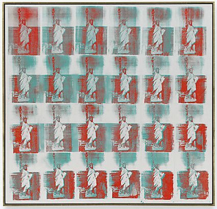 Andy Warhol created his silk screen painting Statue of Liberty in 1962 using silkscreen ink and spray paint on linen. Just as the title suggests, the painting’s subject is the Statue of Liberty, repeated in a pattern twelve times (not including the right side ofthe painting where the image repeats four additional times, but is cut off). The painting is currently being exhibited at the Arkansas Arts Center, but it belongs to the Andy Warhol Museum in Pittsburgh, Pennsylvania. It is relatively large at 80 by 61 inches One must look up at the painting if not standing far enough away to view it in its entirety.
The image that repeats twelve times in the painting is that of the Statue of Liberty standing face on, and we view her from her legs up. We are able to see her torch, or at least most of it, and the horizon in the background. The painting is mostly in the cool hue of blue, but not in its normal value; it may have some green mixed in with it. In contrast to the blue, there is the warm hue of red visible in the top right quarter of the painting. The painting is not centered on the linen, but rather somewhat aligned to the right, so there is a significant amount of unused or unpainted space on the left side. The repetition of the statue’s image gives the work a sense of unity, while the differences between the twelve images in the pattern (and there are many) offer variety. It appears as though the image of the statue itself is not painted for the most part, but it must be to some degree or it would not be distinguishable, so it must be a significantly lighter value than the blue that colors in the ocean. The sky in the background is the color of linen. The blue and/or red paint (depending on which rectangle it is) fills in the ocean in the bottom two thirds of each rectangular image. In about three fourths of the rectangles there is a cloud of blue in a darker value than that used on the statue that shrouds the statue’s face and/or torch, preventing us from seeing the entire image clearly. There are two rectangles at the top right corner of the work in which red paint is used, if you do not count the rectangles to the far right that are cut off. Because the painting is aligned to the right, and because the red paint is only used in the rectangles in the top right corner, there appears to be more weight on the right and less on the left, more weight on the top and less on the bottom. It looks like someone is pulling the painting up and away by its top right corner, like a tissue being pulled out of a tissue box. The torch the statue holds, though it is certainly an implied line, surprisingly does not direct my eyes elsewhere. A grid of six implied lines is created by the repetition of the image. They are in between the four columns and four rows, unpainted and the color of linen. A line is created where the bluish ocean and the linen-colored sky meet. There are subtle, unstable lines that imply motion in the water behind the statue, more subtly in some rectangles than in others. Besides the shapes I have already described in the painting, the screen printing technique has left some areas of unpainted linen, particularly in the top row, where you find what is almost a perfect right triangle on the right side of the statue. Also, in the third row you find an organic but otherwise indistinguishable shape which slightly resembles a jagged mountain range. There is light in each rectangle illuminating the statue and the ocean and modeling the statue’s three dimensions. The color value of the repeated image changes from rectangle to rectangle, very clouded in some and extremely clear in others. Because the face of the Statue of Liberty varies between clearly visible, somewhat visible and entirely covered from rectangle to rectangle, the presentation changes with each second your eyes moves across the painting. The statue is fixed, providing unity, because regardless of what we are able or not able to see in any given rectangle, we know it is the Statue of Liberty. It’s the movement (or the complete disappearance) of the cloud that gives the pattern its variety. If symmetrical balance is used to express order, then this work is slightly unbalanced in that regard because of the tissue box effect I mentioned earlier. The empty space on the left side of the painting is somewhat balanced by the red paint in the upper right corner, but not to the degree that I would consider asymmetrically balanced. You might think the cloud-like shape that covers the face of the statue is an effort to either emphasize or subordinate the statue’s face or the torch she holds, but I think it’s not her face we are suppose to care about so much as the fact that she is covered or uncovered in various ways in an inconsistent manner. The Statue of Liberty is gigantic (I presume, because I have not seen it myself), but here its image is presented in a shrunken size and then multiplied by twelve. The rectangles are all in correct proportion to one another, and the movement of the cloud of blue creates an overtly even rhythm that envelops the whole piece. The Statue of Liberty represents more than I can fully explain in this paper. I think the repetition of the image in twelve different rectangles represents the wide variety of experiences have when immigrating to this country, and the movement of the blue cloud represents the differences among experiences. The empty space on the left side of the painting implies that the ideal America—the America that immigrants dream of going to—is not as all-encompassing as some people might think. In other words, the greatness of the dream falls a bit short in reality. Warhol has taken the Statue of Liberty, with its hard, smooth surface, shrunken it significantly, multiplied it by twelve, and made it hard and gritty in every single repetition. His screen printing technique leaves a kind of blob covering the statue in different areas, and this gives the painting a quality of elusiveness. This elusiveness lends itself to the idea that the general perception of immigration to America is a generic one, and yet it could turn out to be so many different things, depending on how much money you have and who you know. The artwork, which is vertical in its organization, is made up of six strips of color and floral fabric running in a vertical direction. On the left three squares, each with a different subject, line up again in a vertical fashion each with a different background color which are (in descending order) orange, green and red. The orange square contains a
revolver/gun, the green square contains a sporting event scene, and the red contains a rose, all of which are line drawings in black. Overlapping the lower portion of the orange square is a smaller square canvas representing what looks like a still life of lemons and other fruit with a pink background. On the green square Strause has again placed a smaller canvas with a fruit-like composition, this one with a blue background. Above the orange square appear four red circles beginning at the top and extending horizontally stopping at the mid-point. Taking up the entire right side of the work is a still life of a flower arrangement sitting on a stool. Throughout the piece, Strause has used a wide range of bright colors. In the flower arrangement, Strause has used an intense blue line which outlines the flowers and the stool, perhaps this use of color in the line is intended to push the subject forward on the two-dimensional space, making it stand out. The line looks to have been made with a pastel medium, with its less than solid appearance. The flowers themselves are depicted using organic shapes to give the illusion of an iris and other flowers. The overall use of color and shape is simplistic, yet true to the nature of each particular flower. The flowers seem to reach out past the squares at the left, which seem to be on the top of the flowers since one just sees the stems on the other side. Mass doesn’t seem to be important to Strause, as she has used the indication of three-dimensionality only sparingly with a hint of highlight on a few flowers and on the clear glass vase holding them. Another effect used to show three-dimensionality is the shadow left by the arrangement, green in color, and the stools legs receding by being higher than the legs in the foreground. Again, the attempt seems to be a crude one, as though a naturalistic portrayal was not important. The large vertical panel of the floral fabric gives a sense of texture to the background of the flower arrangement, as does the energetic application of the paint in both the fruit and the flowers. Balance is achieved, although asymmetrical, by the large flower arrangement on the right and the squares on the left. Although the left side of the artwork has more geometric shapes and the right side has more organic shapes, indicating variety, Strause has achieved a sense of unity with her use of color. The orange, green and red of the squares are utilized in the colors of the flowers and also the shadow of the vase. This use of a wide range of colors is another sign of variety in the piece. The focal point in the work is the flower arrangement, which is quite large on the canvas and is “pushed” forward in space by the use of the intense blue line emphasizing the contours of shapes of the flowers, vase and the stool. There is a wide range of media used in this artwork, including: oil paint, silk screen, fabric, and pastel. This shows the adeptness of the artist in a variety of media. The subjects inside the squares on the left of the painting are applied using a silkscreen method. The use of line here appears more carefully planned, showing the precision of the artist. The backgrounds of both the red and green squares are more carefully applied, in that the boxes are filled by the color, than that of the orange square with its unfinished appearance. The four red circles arranged horizontally across the tops of the left side of the painting are also painted as if left unfinished. The silk screen shows Strause’s accuracy in drawing, while truthfully creating the likeness of a rose. Her technique in applying the oil paint varies in the artwork. At times, the paint is carefully applied leaving no spaces, such as within the red and green squares. In other cases, Strause’s application of the paint seems more erratic and quick such as the orange square and the flowers. This gives a feeling of action and enthusiasm, unlike the feeling of easiness in carefully applied paint. As I sit and stare at Strause’s work of art, I ponder the title: Your Turn. Looking at the colors used in the square panels on the left (red, green, orange), I notice that these colors are like the colors of a stoplight. The orange being seemingly unfinished suggests quickness in the paint’s application, perhaps implying the quickness at which people speed through an orange light. Also, the color orange is synonymous with “caution” and inside the orange square is a gun. This combination is a powerful suggestion of warning. In the green square, there is a scene of men running with a ball, which exemplifies motion. Both the green color and the action of the scene suggest “go”. The red square contains a rose, of which most people associate with the color red. Where Strause has used items in the previous squares that go along with the stoplight theory, the rose seems to be a different matter. It doesn’t overtly suggest “stop” as would the red of a stoplight. However, red is also symbolic of “love”, which could mean a stopping point in the search for love or red symbolizes blood which when lost in great quantities could mean the stopping of life. The four red circles at the top left arranged horizontally stopping at the middle, can also go along with the stop light theory. The circles seem to be a representation of blinking lights, which is another type of stoplight. The vertical stripes in the background could possibly convey roadways. All of this traffic signal symbolization leads us back to the title of the piece—Your Turn. At stoplights, people take turns moving across the intersection perhaps that is the reason for the title. However, the flower arrangement, colossal in size, takes up most of the space and seems to be the most important subject of the piece. The blue line used to outline the shapes appears neon-like forcing the arrangement to move forward in space and to gain the attention of the viewer. These two aspects alone imply that it is the focus of the artist’s intent. All said, I believe that Strause is conveying her concept of life. She shows us the “traffic signals” and “highway” verticals as a way of portraying the fast paced life most of us lead. As life is being represented in the squares, Strause is suggesting that this life we lead does indeed produce a product (i.e. the fruits of our labors) in the fruit laid on top of the underlying squares. The intense flower arrangement is what she is really trying to convey as a thought, with its immense size and bright colors. It is, perhaps, her way of saying that we should stop and smell the flowers making sure we are enjoying life as we journey through existence.  Andy Warhol’s piece titled Details of Renaissance Paintings (Sandro Botticelli,
Birth of Venus, 1482) represents the face of the goddess Venus. This piece was made in 1984 as a depiction of the face of Venus from the earlier painting The Birth of Venus by Sandro Botticelli that was completed in 1482. The piece’s present location is the Arkansas Arts Center, and its original location is the Andy Warhol Museum in Pittsburgh, Pennsylvania. The piece is acrylic and silkscreen ink on linen, and it can only be seen from one side because it is hanging on the wall. The work is a colorful representation of the face of the goddess Venus as depicted earlier in The Birth of Venus by Botticelli. However, Warhol uses more colors in his work. Venus’s face and neck are pink while her hair is black, red, orange, and yellow. In contrast, the background is a solid light blue color. In Details of Renaissance Paintings, Venus’s face and hair are emphasized and the dominant elements are her hair because of the warm colors and her gaze. Warhol uses implied lines to direct viewers’ eyes around the artwork. The implied lines are the strands of Venus’s hair that direct viewers’ eyes to the right bottom, middle, and top because the strands are going in each of these directions. One bundle of hair goes down to the bottom of the piece on the left side close to her face. This bundle of hair brings some direction to the left side, but not a lot because the left side is mostly empty. However, this emptiness is balanced asymmetrically by Venus’s gaze toward the bottom left corner and the light color used in the empty space. The light color of the empty space is visually light; therefore, it does not have as much weight as the darker, warmer colors of Venus’s face and hair. This visual lightness along with Venus’ gaze is strong enough to balance the multitude of hair and part of a flower on the right side. This artwork is composed of shapes because it is two-dimensional. Most of the shapes are formed by lines and shifts in color. For example, Venus’s red hair is formed by a shift from the blue background and her pink upper body. Lines outlining her hair in certain places also give form to the shape of her hair. Therefore, both lines and shift in color are used together in some places and separate in other places to create the shapes in the artwork. In this piece, the light source is not seen. However, the light source is to the left of the artwork because Warhol uses a light yellow color on top of the pink color that is already present on the left side of Venus’s face which makes it seem like a glow is cast upon her face. Warhol’s use of warm colors for Venus, her hair, and the plant in the top right corner contrasts with the light blue background. These warm colors make her stand out from the background. Also, the warm colors against a calming blue background give Venus an ethereal quality. Warhol’s use of colors also creates unity and variety. His use of warm colors throughout the piece and his use of one solid-colored background create unity in the artwork. However, the contrast between warm colors and the cool color create variety. The flower in the top right corner also creates variety because it is not a part of Venus, who is the focus. The flower is the only other thing in the artwork besides Venus which makes the viewer question its purpose. The placement of Venus’s hair and the curves of her hair create a sense of motion. One bundle of her hair is at the bottom of the artwork. Another few bundles are in the middle and are slightly separated. Another bundle of hair is at the top of the artwork. All of these bundles are curvy to suggest movement as if her hair is being blown gently by the wind. Warhol’s use of colors gives Venus a modern look instead of the traditional white color used in The Birth of Venus that symbolized purity. The pink color used for her body makes Venus seem bold and strong, not just beautiful, as a female goddess should be. Warhol further shows this by only depicting her face down to her shoulders and not including her breasts and other sensual parts that are included in The Birth of Venus. Through his use of color, Warhol created a different symbol of boldness and strength for Venus instead of the traditional symbol of beauty. This boldness and strength coincides with the role of women in modern society because women today are taught that they can accomplish anything and everything while being independent. 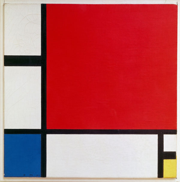 Somehow, the red does not look quite as red as it might. There is no shortage of red in this painting and you would expect that it would dominate. It occupies over half of the field and the only colors counterbalancing it are the relatively minor squares of blue and yellow, plus bands of white and thick black lines. It is a consequence of the neutral elements of black and white balancing the positive element of the red that means these elements are not allowed to have a neutral function. They have a certain agency induced upon them by virtue of answering the primary colors. They are activated by the structure of the painting, which is curiously dynamic in its push and pull of presence. This could explain why the red is not as overpowering as it might otherwise be. The challenge of this painting, as of all abstract painting is what to say about it. To describe the colors as being activated suggests a kind of formalism or invokes the formalesque, which involves observing how the work is harmonious, but does not consider how it reveals meanings. The mood evoked by this painting and the careful placement of color suggests, however, that it has a meaning deeper than mere formalism would allow. There is no figure in this painting to act as a surrogate for the viewer, yet the work seems nevertheless to be about the sublime and the uncontactable. The large red zone, which is suspended by borders that are in turn suspended around the edges, invites unmediated contemplation of the essential. It is an absolute or elemental component of visuality, namely the colour red. You cannot get more basic than that, other than the fellow primary colours, yellow and blue. Add the two primary tones of black and white and you have an allegory of essence (or being) in minimal physical form.
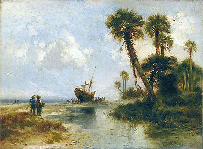 Thomas Moran creates a work of art directly influenced by nature. His, Florida Scene, predominately utilizes organic shapes. The southern landscape has irregular, often curving or rounded forms as seen in the vegetation, ocean, and sky. The few trees seen bear long, curving branches. Beneath the trees lie numerous green, round shrubs and wild flowers. The untamed aquatic weeds surrounding the seemingly shallow, natural pond in the right appear to grow in every direction. The irregular, almost threatening appearing, bayonet shaped leaves of the palm fronds flutter in the breeze coming from the ocean. Above the tidal waves of the ocean is the clear sky. The clouds are ambiguous, constantly morphing into new shapes. Moran’s piece is an example of the technique, atmospheric perspective, a nonlinear means for indicating an illusion of depth. He subtlety changes color, value, and detail to provide a real sense of being present in the tropical climate of the Sunshine State. Tones of pale yellow unite the sandy beach and sky evoking a humid, hazy atmosphere Florida is notorious for. The dominant subject, or figure of the composition is the curving palm tree in the center, jutting from the side of a sandy hill towards the direction of the ocean. In the background, lies the ocean, a large ship, and passengers descending from the boat, these figures diminish in size giving a feeling of increased distance between them and the viewer. These faraway objects are seen beyond an increased quantity of air, moisture, and sandy wind causing them to appear much bluer and less distinct then the foreground weather-worn palm tree. The ship and her passengers lack detail in comparison to the palm tree. The palm tree is complete with strokes defining each individual leave of the palm fronds and intricate rings decorating the bark of the trunk. The ship lacks such adornment, each plank of wood making up the boat cannot be distinguished and the people in the picture do not have faces or fingers. The colors used in Moran’s art are mostly comprised of cool colors, green vegetation and blue ocean and sky. The color scheme is analogous as the piece includes variations in color between hues adjacent to one another on the color wheel, for example yellow-green, green, and blue-green. The clouds are neutral tinted a white, adding to the like-like quality of the work. The components in the background of Moran’s artwork lack the color intensity of the figures in front, there is less of a contrast between light and dark. Moran creates an implied illusion of motion in his, Florida Scene. The center palm tree alludes to be growing towards the water, the ocean. The figures leaving the boat are blurred seeming to be walking towards the viewer as they explore the foreign land. With no dock present, the boat appears to be bobbing along the rough ocean.In, Florida Scene, there is a balance between unity and variety. The components such as the trees, ocean, and sky belong to one another. These natural elements combined embody nature, they form a harmonious whole. If Moran were to subtract the trees, ocean, or cloudy sky the piece would diminish in quality, the title would no longer be appropriate as these elements truly define the landscape of Florida. The placement of dark green, low-lying shrubs are repeated throughout, sprouting all the way from the left hand side to the right. Variety is displayed by the many diverse species of vegetation, there are palm trees, an oak tree, shrubs, weeds, and flowers in the piece. The people from the boat are uniquely individual, each walking their own path and wearing different outfits. <br />Moran creates asymmetrical balance in his art, the left and right sides are not the same. Various elements are balanced by size, shape, or placement to establish a visual equilibrium. On the left, there is much activity going on, there sails an old ship and her passengers are roaming around on shore. On the right of the piece is an enormous sand hill with palm trees planted atop it. The great size of this landscape feature is heavy and attention getting which helps to balance the smaller in size, interesting liveliness of the people on the left. Immediately, the primary focus of attention goes to the palm tree in the center, the focal point of the work. The tree is visually positioned as the tallest as well as has the most detail compared to other aspects in the work. The green treetop of the palm highly contrasts with the white clouds surrounding it. The clouds are an area of lesser interest, lacking intense color and detail, subordinate to the emphasis of the piece. There is a repetition of visual elements, round organic shapes appear throughout the work. The round, green shrubs and curving clouds are repeated, these repeated curves provide flow. The shrubs build a movement toward the ultimate peak in the right of the picture, atop the hill is repetition and rhythm, in the form of five erect palm trees.<br />Interpretation<br />Thomas Moran was born in England; however is regarded as one of America’s most important Hudson River School artists. His biggest competitors flourished from Hudson as well, they include Frederick Edwin Church and Martin Johnson Heade. Moran had a personal desire to explore and paint exotic, uncultivated places, he is renowned for his panoramic scenes of the American West. Moran embarked on his first journey to Florida in 1877, he visited Fort George Island which is located at the mouth of St. Johns River near Jacksonville. This trip was funded by Scribner’s Monthly magazine in order to promote tourism to the unknown southern state. Moran’s work illustrates the landscape of Florida, yet he might have romanticized the location based upon his bias of love for uncultivated nature and to attract transplants. In Moran’s, Florida Scene, there is a ship and people in the background. The ship is in process of letting off several people who appear to be grateful for standing on solid ground, they are conveyed joyfully strolling. The people depicted have dark brown skin and brightly colored clothes, perhaps they arrived from the nearby Caribbean Islands to seek jobs. The individuals featured likely convey workers returning to find employment at Fort George’s free labor orange grove. The orange grove had replaced the island’s pre-Civil War cotton and sugar-cane fields. The humans in the work help to convince those skeptical of visiting Fort George; the island is not desolate there are people, transportation, and work. The environmental reality of Florida is harsh and unforgiving. The climate in northern Florida can be more pleasant than the merciless humidity and heat in the south of the state. As revealed in the piece, Florida has sandy soil which is not the best for growing vegetable gardens in. However, during the winter the Sunshine State is paradise and draws crowds of people to its warm, tropical beaches. During 1877, many inhabitants of Florida were misfits, for example criminals fleeing from the north, foreigners arriving for work, or the few trying to prosper in the rough frontier. As a result, a major religious practice or firm cultural values were not established; the residents were too scarce and diverse. <br />Evaluation <br />Thomas Moran’s work has value, it epitomizes the natural landscape one would discover in Florida. Moran’s art is worth considering because it captures the unique features of the hazy atmosphere. Unlike his contemporaries, Moran, has the ability to depict the notorious climate; he communicates the raw essence of the humidity found on the beach. I am convinced when viewing this work of art that I am squinting and sweating from the sun while watching people come ashore. Personally, I value this skillfully crafted, extraordinary piece because it triggers memories in me. Being raised in Florida all my life I have come to appreciate the gorgeous landscape that surrounds me. The piece exudes the feeling of being lost in a tropical, exotic oasis. Moran’s, Florida Scene, has value nationally. Originally sent to foster tourism in Florida, Moran created a masterpiece which highlights nature in all her shining glory. He succeeds in catching a moment of historic permanence during a time when America was rapidly changing. His work envisions the ideal, rural locations a young America was known for. Moran can be regarded for uncovering the natural beauty America, especially Florida, has to offer. Thomas Moran was acclaimed for his expertise in bringing to life idyllic places, manifesting almost an escape as one would gaze into his works and feel as though they were there
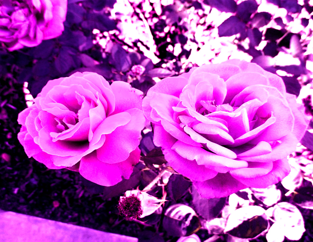 This is one of my personal photos which i have flipped into a computer art. I made it seem almost magical with the pink glow and a bit of saturation which can make your work seem magical. I don't know if this counts as magical realism but I feel like it does due to the fact of of the real rose with the pinkish glow.
 This art makes me think that the artist was trying to express daily struggles of all people buried deep down. I feel like the puppet strings are meant to imply that fear, panic, frantic and pacing are things that control all off us. Fear can eat away at you and lead to all of these things that can make us self doubt, panic or even just have emotional times. I like this mixed media because it creates a nice effect of reality vs. whats in your head.
So yesterday was Halloween. Today starts Dia de los Muertos so I'm considering doing an artwork for this to honor my family and the holiday itself. Dia de los Muertos is important to my family because it helps us honor those who are no longer with us. Day of the Dead is an interesting holiday celebrated in central and southern Mexico during the chilly days of November 1 & 2. Even though this coincides with the Catholic holiday called All Soul's & All Saint’s Day, the indigenous people have combined this with their own ancient beliefs of honoring their deceased loved ones.
They believe that the gates of heaven are opened at midnight on October 31, and the spirits of all deceased children (angelitos) are allowed to reunite with their families for 24 hours. On November 2, the spirits of the adults come down to enjoy the festivities that are prepared for them. In most Indian villages, beautiful altars (ofrendas) are made in each home. They are decorated with candles, buckets of flowers (wild marigolds called cempasuchil & bright red cock's combs) mounds of fruit, peanuts, plates of turkey mole, stacks of tortillas and big Day-of-the-Dead breads called pan demuerto. The altar needs to have lots of food, bottles of soda, hot cocoa and water for the weary spirits. Toys and candies are left for the angelitos, and on Nov. 2, cigarettes and shots of mezcal are offered to the adult spirits. Little folk art skeletons and sugar skulls, purchased at open-air markets, provide the final touches. Day of the Dead is a very expensive holiday for these self-sufficient, rural based, indigenous families. Many spend over two month's income to honor their dead relatives. They believe that happy spirits will provide protection, good luck and wisdom to their families. Ofrenda building keeps the family close. On the afternoon of Nov. 2, the festivities are taken to the cemetery. People clean tombs, play cards, listen to the village band and reminisce about their loved ones. Tradition keeps the village close. Day of the Dead is becoming very popular in the U.S. ~ perhaps because we don't have a way to celebrate and honor our dead, or maybe it's because of our fascination with it's mysticism. Straddling the line between fall and winter, plenty and paucity, life and death, Halloween is a time of celebration and superstition. It is thought to have originated with the ancient Celtic festival of Samhain, when people would light bonfires and wear costumes to ward off roaming ghosts. In the eighth century, Pope Gregory III designated November 1 as a time to honor all saints and martyrs; the holiday, All Saints’ Day, incorporated some of the traditions of Samhain. The evening before was known as All Hallows’ Eve and later Halloween. Over time, Halloween evolved into a secular, community-based event characterized by child-friendly activities such as trick-or-treating. In a number of countries around the world, as the days grow shorter and the nights get colder, people continue to usher in the winter season with gatherings, costumes and sweet treats.
ANCIENT ORIGINS OF HALLOWEENHalloween’s origins date back to the ancient Celtic festival of Samhain (pronounced sow-in). The Celts, who lived 2,000 years ago in the area that is now Ireland, the United Kingdom and northern France, celebrated their new year on November 1. This day marked the end of summer and the harvest and the beginning of the dark, cold winter, a time of year that was often associated with human death. Celts believed that on the night before the new year, the boundary between the worlds of the living and the dead became blurred. On the night of October 31 they celebrated Samhain, when it was believed that the ghosts of the dead returned to earth. In addition to causing trouble and damaging crops, Celts thought that the presence of the otherworldly spirits made it easier for the Druids, or Celtic priests, to make predictions about the future. For a people entirely dependent on the volatile natural world, these prophecies were an important source of comfort and direction during the long, dark winter. To commemorate the event, Druids built huge sacred bonfires, where the people gathered to burn crops and animals as sacrifices to the Celtic deities. During the celebration, the Celts wore costumes, typically consisting of animal heads and skins, and attempted to tell each other’s fortunes. When the celebration was over, they re-lit their hearth fires, which they had extinguished earlier that evening, from the sacred bonfire to help protect them during the coming winter. By 43 A.D., the Roman Empire had conquered the majority of Celtic territory. In the course of the four hundred years that they ruled the Celtic lands, two festivals of Roman origin were combined with the traditional Celtic celebration of Samhain. The first was Feralia, a day in late October when the Romans traditionally commemorated the passing of the dead. The second was a day to honor Pomona, the Roman goddess of fruit and trees. The symbol of Pomona is the apple and the incorporation of this celebration into Samhain probably explains the tradition of “bobbing” for apples that is practiced today onHalloween. On May 13, 609 A.D., Pope Boniface IV dedicated the Pantheon in Rome in honor of all Christian martyrs, and the Catholic feast of All Martyrs Day was established in the Western church. Pope Gregory III (731–741) later expanded the festival to include all saints as well as all martyrs, and moved the observance from May 13 to November 1. By the 9th century the influence of Christianity had spread into Celtic lands, where it gradually blended with and supplanted the older Celtic rites. In 1000 A.D., the church would make November 2 All Souls’ Day, a day to honor the dead. It is widely believed today that the church was attempting to replace the Celtic festival of the dead with a related, but church-sanctioned holiday. All Souls Day was celebrated similarly to Samhain, with big bonfires, parades, and dressing up in costumes as saints, angels and devils. The All Saints Day celebration was also called All-hallows or All-hallowmas (from Middle English Alholowmesse meaning All Saints’ Day) and the night before it, the traditional night of Samhain in the Celtic religion, began to be called All-hallows Eve and, eventually, Halloween. HALLOWEEN COMES TO AMERICACelebration of Halloween was extremely limited in colonial New England because of the rigid Protestant belief systems there. Halloween was much more common in Maryland and the southern colonies. As the beliefs and customs of different European ethnic groups as well as the American Indians meshed, a distinctly American version of Halloween began to emerge. The first celebrations included “play parties,” public events held to celebrate the harvest, where neighbors would share stories of the dead, tell each other’s fortunes, dance and sing. Colonial Halloween festivities also featured the telling of ghost stories and mischief. TODAY’S HALLOWEEN TRADITIONSThe American Halloween tradition of “trick-or-treating” probably dates back to the early All Souls’ Day parades in England. During the festivities, poor citizens would beg for food and families would give them pastries called “soul cakes” in return for their promise to pray for the family’s dead relatives. The distribution of soul cakes was encouraged by the church as a way to replace the ancient practice of leaving food and wine for roaming spirits. The practice, which was referred to as “going a-souling” was eventually taken up by children who would visit the houses in their neighborhood and be given ale, food, and money. The tradition of dressing in costume for Halloween has both European and Celtic roots. Hundreds of years ago, winter was an uncertain and frightening time. Food supplies often ran low and, for the many people afraid of the dark, the short days of winter were full of constant worry. On Halloween, when it was believed that ghosts came back to the earthly world, people thought that they would encounter ghosts if they left their homes. To avoid being recognized by these ghosts, people would wear masks when they left their homes after dark so that the ghosts would mistake them for fellow spirits. On Halloween, to keep ghosts away from their houses, people would place bowls of food outside their homes to appease the ghosts and prevent them from attempting to enter. HALLOWEEN SUPERSTITIONSHalloween has always been a holiday filled with mystery, magic and superstition. It began as a Celtic end-of-summer festival during which people felt especially close to deceased relatives and friends. For these friendly spirits, they set places at the dinner table, left treats on doorsteps and along the side of the road and lit candles to help loved ones find their way back to the spirit world. Today’s Halloween ghosts are often depicted as more fearsome and malevolent, and our customs and superstitions are scarier too. We avoid crossing paths with black cats, afraid that they might bring us bad luck. This idea has its roots in the Middle Ages, when many people believed that witches avoided detection by turning themselves into cats. We try not to walk under ladders for the same reason. This superstition may have come from the ancient Egyptians, who believed that triangles were sacred; it also may have something to do with the fact that walking under a leaning ladder tends to be fairly unsafe. And around Halloween, especially, we try to avoid breaking mirrors, stepping on cracks in the road or spilling salt. But what about the Halloween traditions and beliefs that today’s trick-or-treaters have forgotten all about? Many of these obsolete rituals focused on the future instead of the past and the living instead of the dead. In particular, many had to do with helping young women identify their future husbands and reassuring them that they would someday—with luck, by next Halloween—be married. In 18th-century Ireland, a matchmaking cook might bury a ring in her mashed potatoes on Halloween night, hoping to bring true love to the diner who found it. In Scotland, fortune-tellers recommended that an eligible young woman name a hazelnut for each of her suitors and then toss the nuts into the fireplace. The nut that burned to ashes rather than popping or exploding, the story went, represented the girl’s future husband. (In some versions of this legend, confusingly, the opposite was true: The nut that burned away symbolized a love that would not last.) Another tale had it that if a young woman ate a sugary concoction made out of walnuts, hazelnuts and nutmeg before bed on Halloween night she would dream about her future husband. Young women tossed apple-peels over their shoulders, hoping that the peels would fall on the floor in the shape of their future husbands’ initials; tried to learn about their futures by peering at egg yolks floating in a bowl of water; and stood in front of mirrors in darkened rooms, holding candles and looking over their shoulders for their husbands’ faces. Other rituals were more competitive. At some Halloween parties, the first guest to find a burr on a chestnut-hunt would be the first to marry; at others, the first successful apple-bobber would be the first down the aisle. Of course, whether we’re asking for romantic advice or trying to avoid seven years of bad luck, each one of these Halloween superstitions relies on the good will of the very same “spirits” whose presence the early Celts felt so keenly. Current work: Ai has always been a political activist. Since 1999, however, his visibility in the public eye, both in the West and in China, has been seen as an active threat by Chinese government officials. Drastic efforts on the part of the government to limit his communication with broad audiences has, somewhat paradoxically, motivated him toward a number of ambitious projects designed to address directly politically sensitive themes in China, such as the internet (subject to government regulations that limit access to many websites, including Google, that many in the world otherwise take for granted). In 2005, he began to express himself via a blog, which he was invited to start by the Chinese internet firm Sina. In 2009 the Chinese government shut down the blog, which at the time was getting 100,000 views a day. Ai began posting on social media site Twitter, gaining worldwide exposure and an online presence that supported his personal conviction that artists need to remain in touch with their public: "as an artist, you have an obligation to let people know what is on your mind and why you are doing this."
One of Ai's most famous projects, popularly known as the Bird's Nest, was his design for the 2008 Beijing Olympics stadium. In designing the structure, completed in collaboration with Swiss architects Herzog & de Meuron, Ai expressed his hope that it would instill "a sense of equity and fairness." In the international press, he openly criticized the Chinese government, citing concerns that hosting the Olympics would only increase its abuse of power. This project brought the artist greater international fame and a steep deterioration in his relationship with Chinese authorities. Ai had emerged as something of a problem child. On the other hand, he was by far the most famous Chinese artist, accepted and critically acclaimed in the West. The government's ongoing attempts to have positive relations with the West, despite some growing strains remain critical to China's goals for growth and national success. In a series of impassioned Twitter posts after the Sichuan earthquake of May 2008, he expressed his anger at the death of thousands of schoolchildren due to the shoddy construction of school buildings in the area, evidence of governmental corruption. Hoping to sweep this national embarrassment under the rug, government officials failed to release the numbers (over 5,000 deaths, according to the most recent estimate), and Ai started an independent investigation, bringing the facts and evidence to light. This investigation was interrupted in 2008 when police broke into his hotel room in Chengdu, and beat him so badly that he was hospitalized with a cerebral haemorrhage. Since then, the Chinese government has taken further measures to limit Ai's freedom of movement and communication, both in and outside the country. In 2010 he was put under house arrest for several weeks; in 2011 he was banned from using Twitter, and his home was installed with government surveillance cameras. In 2011 he was arrested at Beijing International Airport and detained without formal charges (the official reason was financial crimes). As all this was occurring, the Western art world watched in horror and mobilized in his defense with the help of international human rights groups. After 81 days, Ai was released and fined over 12 million yuan (US$1.85 million). Chinese and international sympathisers raised the funds to repay what the government claimed it was owed. In July of 2015 he was finally provided with an international passport. While his international reputation did not ultimately shield him from harsh punishment, what led to his eventual release was a global awareness of his situation and increasing diplomatic pressure from democratic countries. He has since relocated to Berlin and held exhibitions in Helsinki, Paris, and other Western cities. LegacyAi's impact on the West is arguably greater than it is in China, where he remains a controversial figure. In the U.S. and Europe he is almost universally revered, both as an artist and political activist, and has led the way to a more nuanced awareness of Chinese contemporary culture in the international community. Some of his most recent works are simple actions designed to call attention to the humanitarian crises. In a 2015 striking performance piece, he posed as the lifeless toddler who washed ashore in Turkey. When a Syrian refugee in a Greek camp mentioned missing her piano, he had one brought to her and videotaped her performance. On an increasingly global scale, Ai's humanitarian efforts focus on those who live in poverty and oppression, and who might not otherwise have a voice. He is an inspirational figure for many people both in the West and in China, and both in and outside the art world. Ai's struggle for freedom of speech and expression sheds light on specific issues that are important in their own right. More broadly, it reminds us of the power of visual art to move us as individuals, and sometimes entire nations, to action. Ai's work underscores the idea that art may have the power, and even the responsibility, to change society. Members of the general public and the wider art community continue to support him. His often enigmatic messages on Instagram and Twitter have moved his "followers" to participate in the creative process by responding in an array of on-line expressions of artistic and political solidarity that are in turn indebted to his approach to art as social practice. In October 2015, for example, when Lego refused Ai a large shipment of blocks (on the grounds that it doesn't endorse political art), hundreds of Ai's followers sent their own Legos to the artist, via mail and official collection points. The entire event was organised through social media. Numerous artists working across a range of media, in China and beyond, have been moved by Ai's expressive conceptualism and fearless activism. These include artist Huang Rui, whose works include provocative performances based on China's relationship with the West. Xu Qu's political conceptual installations are directly inspired by Ai's. As a high-profile, controversial figure (as well as a stark example of how dangerous political activism can be) it is also entirely possible that Ai's activism has put a negative spin on political art for a growing group of young Chinese artists who have retreated from contemporary politics, claiming that they know a different (better) China from that experienced by Ai, and that political art belongs to an older generation. ChildhoodAi Weiwei is the son of writer Gao Ying and poet Ai Qing. His father was very well-known in China, and had been imprisoned by the Nationalist government before Ai's birth on suspicion of being a Leftist. After the People's Republic of China was founded, Ai Qing was accused again, this time of being a Rightist, during Chairman Mao's anti-intellectual campaign. The family was exiled when Ai was only one year old. His father's poetic artistry and the family's precarious political situation were to have a deep effect on the artist.
The family lived in exile for twenty years, in small villages near the North Korean border and in the province of Xinjiang, where his father was forced to carry out hard labor, including cleaning communal toilets. In order to survive as a child, Ai learned many of the practical skills that he would later apply to his art - such as making furniture and bricks. He says of his childhood that "living conditions were extremely harsh, and education was almost non-existent." The family had been able to keep only one book, a large encyclopedia - Ai's only source of information and education. Early Training Ai Qing and his family were allowed to return from exile after Chairman Mao's death in 1976. This allowed the 19 year old Ai to enroll in the Beijing Film Academy to study animation. Within a couple of years, he had started to get involved with the unofficial Beijing art scene, and was one of the first members of The Stars. This was a subversive political group of artists who wanted to reintroduce the idea of art as self-expression to China, after decades of Mao's policy of art serving the communal interests of the state. He also took part in a number of pro-democracy marches and rallies. In 1981, he moved to the US, studying in piecemeal fashion at various institutions, trying to improve his English. He eventually moved to New York in 1982, where he studied at the Parsons School for Design under artist Sean Scully. He dropped out after six months, and instead tried to make a living as a street artist and odd-jobber. Ai stayed in New York for 11 years, immersing himself in the contemporary art scene and taking photographs of the city, which would later be put together as a work known as the New York Photographs (1983-1993). He also met and befriended the beat poet Allen Ginsberg, who had once traveled to China and met Ai's father. During this period he also traveled round the US, and became interested in the game of blackjack being played in Atlanta casinos. He became so adept at the game that US blackjack players know him first and foremost as a professional gambler, rather than as an artist. Mature PeriodAi's first solo show, entitled "Old Shoes, Safe Sex" was held in New York in 1988 at Art Waves/Ethan Cohen Gallery. Five years later his father became ill and he returned to Beijing. While there, he produced three books on interviews with some of his favorite Western artists, including Marcel Duchamp, Andy Warhol, and Jeff Koons, and drew connections between this older generation of artists and an emerging generation of iconoclasts (which included himself) in Beijing. In 1996, his father passed away. Ai has identified his father as the single most important influence on his life. Delving more deeply into a traditional Chinese practice that he had learned from his father, he spent the last half of that decade making furniture. Despite no formal training in architecture, in 1999 he built himself a house and studio in north Beijing, and in 2003 founded an architectural practice called FAKE Design. The year 1999 was a turning point in Ai's life and career. He was chosen to represent China at the Venice Biennale (a mark of high honor and geo-political distinction), a development that lifted him into a high-visibility role in the international arena. In the same year, he co-curated an exhibition in Shanghai, entitled "F**k off". This got the attention of the Chinese government, and not in a good way. In order to understand the impact of this exhibition, it is crucial to know a little bit about the state-sanctioned art of Beijing, dominant since the 1970s. The unstated, but relatively strictly-enforced guidelines were that art should be representational, respectful, and celebrates the lives of everyday people thriving under Communism in a manner consistent with Western Realism - but mostly known internationally as Soviet Socialist Realism. It is impossible, therefore, to overstate the sensational impact of this exhibition showcasing work by the artist who had recently been invited to represent the country at the Venice Biennale, and his circle of Chinese conceptual artists who not only did not follow the state-approved program of glorifying everyday themes in a traditional, representational, propagandistic manner, but whose message could not have been more blunt: "We had to say something as individual artists" Ai said, "and what we said was 'F**k off'." Ai Weiwei is the most famous Chinese artist living today. As an activist, he calls attention to human rights violations on an epic scale; as an artist, he expands the definition of art to include new forms of social engagement. In a country where free speech is not recognized as a right, the police have beaten him up, kept him under house arrest, bulldozed his newly-built studio and subjected him to surveillance. He is viewed as a threat to "harmonious society." The West did not invent revolutionaries. China has an illustrious history of dissidents, anti-authoritarian originals and eccentrics, from the drunken monks of pre-history to counter-culture artists living in today's Beijing. Ai himself is from this long line of free-thinkers and writers, marginalized both by the right and left. From smashing an ancient vase to reciting the names of children who died due to government negligence, Ai's dramatic actions highlight the widening gap between the ideal and the real in Chinese society. He is also one of the earliest conceptual artists to use social media - Instagram and Twitter, in particular - as one of his primary media.
Key Ideas: Ai came of age as an art student in 1990s New York. A time and place where the more outrageously anti-authoritarian and oppositional the statement, the better. He then returned to China, an environment far less open to such views. In Ai's words, "China and the U.S. are two societies with very different attitudes towards opinion and criticism." He saw the difference, and refused to conform. He is an artist who actually put his life on the line to defend freedom of expression. Ai was a professional blackjack player for a brief period early in life. His work is about risk (personal, professional, and political). It is also about testing the limits of freedom. His work is designed to remind us that risk-taking is an essential form of exercise in a free society. Government spying, a hot topic in contemporary art lately, is not some futuristic idea but a fact of life for Ai. Under government surveillance for almost a decade, he has produced some of the most thoughtful work on this contemporary topic that is just as important in current popular culture as the hippies were in the 1960s or the feminists in the 1970s. Trained in the West, Ai is intimately familiar with Conceptual and Minimalist traditions, and combines them. In his refusal to pleasure the eye, he is the opposite of Jeff Koons, his equally famous contemporary. In their visual austerity, Ai's pieces are closely aligned with the work of other global activists, among them David Hammons, Robert Gober, and Doris Salcedo, whose large-scale projects call attention to weighty social issues, breaking free from the confines of the gallery and the museum, and bridging the gap between the visual and the social. What is the meaning of the painting American Gothic by Grant Wood? Why is this piece of art so famous and popular?
rtist Grant Wood's American Gothic (1930): Where was the Portrait Painted?American Gothic was in many ways a very personal painting for American artist Grant Wood. Planning to enter an art exhibition in Chicago and in search of local inspiration, in the end it was the architecture of a small house in his Midwestern home town of Eldon, Iowa that inspired Grant Wood to paint American Gothic in 1930, one of the most famous Americana paintings of all time and the inspiration of dozens of parodies. Like Wood, the man and woman in the painting are also natives of the small Midwestern town of Eldon, IA, but their relationship is open for interpretation and not what it first seems... U p for Interpretation: Who Are the People in American Gothic?After an initial analysis of the famous painting, many people assume that Grant Wood's American Gothic is just a portrait of a prim and proper older, local married couple, but not a very happy one. In the portrait, the hard, somewhat cold woman frowns and furrows her brow in resignation as she stares off vacantly into the distance. The tight-lipped older man, seemingly an Amish farmer, is stern and somber looking, holding his pitchfork and staring head-on, perhaps anxious to escape the limelight and retreat back to his work on the farm. Why does Wood make this couple look so sad and serious? Though you assume the man and woman in American Gothic are husband and wife, they’re actually not even in a relationship--romantic or otherwise. The people inAmerican Gothic are actually just the artist's sister and the town's local dentist, both recruited by Wood as artists models for the painting. The total lack of physical chemistry and warmth in American Gothic is not just because Wood's two models were bad at posing. The man and woman never physically posed for the painting together, but were actually painted on separate occasions by Wood, partly explaining the awkwardness and discomfort evident in the painting. So why did Grant Wood paint these people together if they didn't really have a relationship? Why do they look so unhappy? As it turns out, much of the meaning of the American Gothic painting comes back to satire and, surprisingly enough, that little American farm house in the background. American Gothic Architecture & Meaning of the SatireAccording to artist Grant Wood, much of his attraction to the house featured in the background behind the couple was due to its quaint architectural style: American Gothic. Also referred to as "carpenter Gothic," this suburban style of home popular during the Depression era was meant to mimic the lofty, vaulted Gothic architecture of historic European cathedrals--though obviously at a price the working class could afford to buy and live in. While cathedrals often work as symbols of timeless elegance and enduring grandeur, American Gothic homes like the one seen in Wood’s painting, on the other hand, are manufactured quite cheaply and quickly, not built to stand for hundreds of years. In American Gothic, artist Grant Wood uses the house to paint a satire of modern American culture, what he perceives as an almost laughable and somewhat off-kilter knockoff of the real thing. Though this new form of "American Gothic" architecture was economical and much more practical than authentic Gothic architecture for the typical American family during Depression era, Wood seems to take issue with its trying to be more dignified and established than it really is. When asked about the couple posing in front of the home, artist Grant Wood said, these are "the kind of people I fancied should live in that house,” thereby insinuating that the couple and the house were both unknowingly ridiculous despite their seriousness. |


